Completion By Design
Client: Bill & Melinda Gates Foundation
Designed at Intentional Futures
My role: Art Director / Video Director / Editor / Illustrator
In 2011, nine colleges in three states— with very different sizes and contexts—set out to increase student success and completion by knocking down the barriers that stop students at each stage of their journey to credential completion. They came together under the umbrella of Completion by Design in a structured process to transform students’ experience—and ultimate success—at their colleges. In 2016 Intentional Futures was brought in to revamp the CBD website with a renewed focus on student success and the lessons learned over the last 5 years. Over the course of a year and a half, I led the design and art direction for our small team who partnered with dozens of other folks to collect stories and data.
Visual Refresh
While our task was not to redo CBD's visual language, it became an integral part of the process when we scrapped the original graphics and began introducing illustration and iconography. The two pieces of CBD's former brand I kept were the logo, and orange, which I reduced from 4-5 inconsistent usages and styles for each to a single logo with favicon, and one ownable orange. I also removed all the busy textures and patterns that were behind the logos and overlaid on infographics, opting for a cleaner look.
Lots of education websites feel outdated and flat because the emphasis is rightly on content - not visual appeal. To make CBD stand out, I put together style requirements for our illustration and infographics and worked with Savy Bergeron to create a suit of caricatures that appeared on nearly every page of the site. The results were a crisp, clean, festive images that were well received by our clients and users.
Strategic Planning
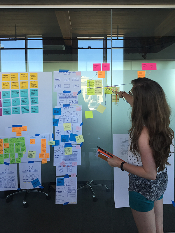
The CBD site was still being used by regular users within the initiative. Deciding what to trim, what to change, and what to expand was a tricky process and we spent months understanding all the content and proposing alternative structures. We ultimately bucketed all the content into 'keep as-is', 'improve,' 'consolidate', and 'remove' and proceeded with the site design from there.
Website Restructuring
The previous CBD site had undergone a few rounds of revisions and extensions which had left it disjointed and somewhat difficult to navigate. Our task was to preserve the resources for returning users, as well as create a Waze-like experience for newcomers. We needed to build in a robust introduction, include personal testimony and lessons learned, and incorporate results data (none of which appeared on the previous site).
Below you see the pages from the original site (left) next to our redesigned and more comprehensive site (right). We paced out information more slowly, allowing users to better understand each segment of content and jump out to deeper-dives as they desired. In our tests with both old and new users, this approach resonated well and cut down on the cognitive overload on the previous site.
Filming Trips
A significant portion of our redesign centered around the teacher, advisor, administrator, and student stories from the last 5 years. It's one thing to read pages of suggestions and insights, but entirely another to hear the heartfelt testimonies of the people involved. We flew out with a small NYC-based film crew to the three states involved in the initiative and captured almost 50 hours of footage which I edited into 26 videos spread around the site.
“It’s interesting, these little efforts that we make as humans to other humans, you don’t realize the impact it has on that other human being when you do it. Kindness, and encouraging people…I think goes a long way and it’s something you can’t quantify in the Completion by Design agenda, but its the unwritten rules of doing this work…to do this work you have to want people to succeed.”
- Krista O'Neill / Student Advisor, Ohio
Celebration Boxes
As part of our wrap-up and celebration of the initiative, we created gift boxes for the schools and individuals involved. In each box were lapel pins, notebooks, pens, stickers, candy, and postcards for handing out at conferences.
In interviews with teachers and staff, over and over we would hear about the affect that seeing graduation data had on them. These were talented, hard-working people who were unable to see the larger picture of their student's barrier-laden pathways, and hearing that after leaving their classrooms the majority of students were not making it to completion was devastating.
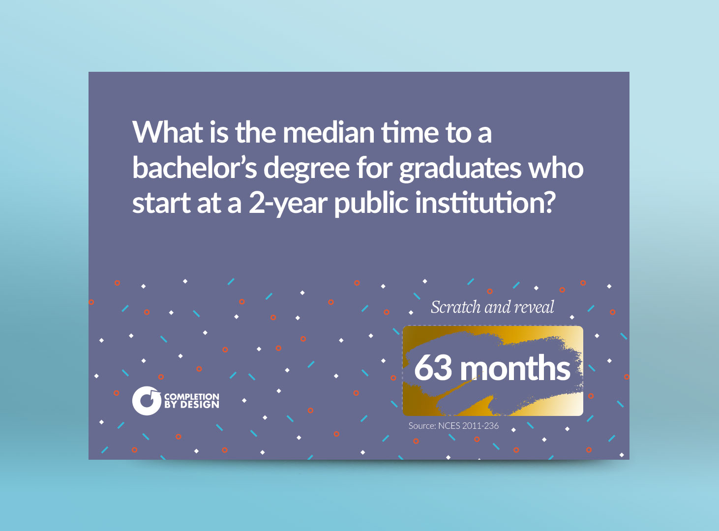
Many of the initiative participants speak at conferences throughout the year and we wanted to provide them with some of the most stark data pieces on easy to hand out postcards. The reveal that the median time to a bachelor's degree for students who start at a 2-year institution is 63 months is not a reality most educators are aware of.


