College Readiness Data Analysis Tool
Client: Bill & Melinda Gates Foundation
Designed at Intentional Futures
My role: Art Director / designer / video editor
While at Intentional Futures I took part in a year-long design-research project to build an interactive visualization tool to synthesize teacher, principal, and administrator survey data across the country. The intent was to build a site accessible to education leaders where disparities in survey answers between different educator levels could be pinpointed and addressed. We needed to capture and compare across responses for 3 tiers of education staff in 3 states and hundreds of districts. We wrestled with the added complexity that states do not have consistent standards for measuring student success and college readiness.
Disclaimer: All data represented in this case study is placeholder
Research Phase
The first and most complex problem to solve was the roll-up of specific survey questions. We needed to create a system to compare teacher, principal, and district staff survey data but not all the questions were directly comparable. Breaking out which questions related across the 3 tiers was a lengthy process.
We eventually built out a table highlighting what questions were able to be directly or indirectly compared across the the 3 tiers. It helped us later in formulating which broad topics could be accessible to all users and which had to be excluded.
It eventually became necessary to visualize all the moving pieces of this system in one graphic. The chart below became an invaluable tool to us and our client partners in building out the site framework. The mix of public data to supplement the survey data was an interesting problem to solve, as the differences in college readiness standards across states meant a user had to be at a certain drill-down level before the data could be tied to survey responses.
Site Mapping
As we began discussing the site with our client's development team, we built out the site-map below to clarify the complexity of the tool's usability.
Wire framing and Prototyping
We went through several months of wire framing. We wanted the tool to be robust enough to potentially include all 50 states, not just the 3 currently collecting data. We also had to work while making a lot of assumptions about the state of the data we'd receive, as the survey was still in it's infancy.
Following our series of static wireframe explorations, I created a motion walk-through of the product. This was shown around internally by our client company to drum up support for the tool and excitement about the possibilities it opened for education professionals to create change in their districts.
Paper Prototypes
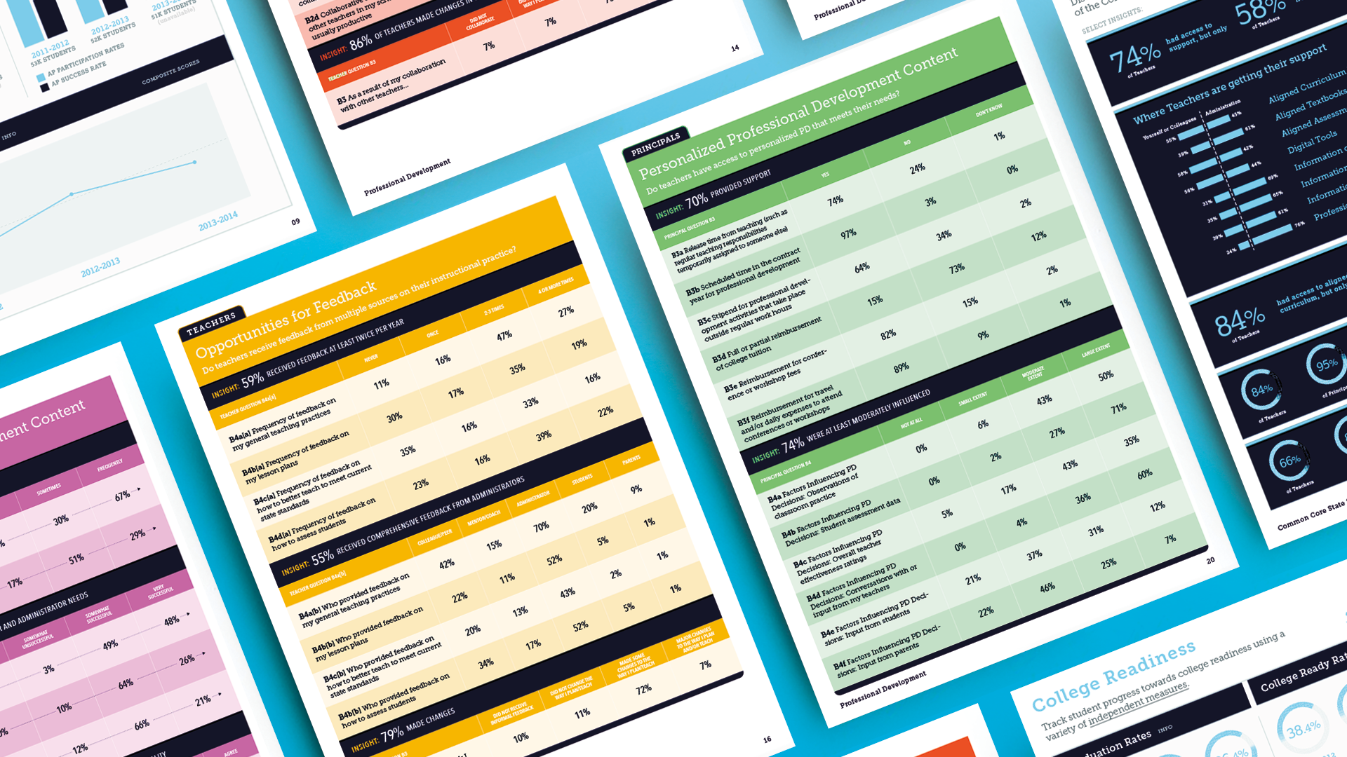
Following our investigation, our client requested that the prototype be paper-ified for a series of summer workshop sessions where many school district representatives would be present. In addition to the data clean breakdown, we included full pages of digestible insights we culled from the larger datasets. It was a great opportunity for feedback, and the reaction overall was positive. The participants loved the accessibility of the data and wanted packets for their own districts. I was lucky enough to attend one workshop and was told by a participating district admin, "this is exactly what I need". Included below are few examples from the 45-page books.


